Your energy counts
- CLIENT
- Endesa
- PARTNERS
- TOOLS
- R; D3.js
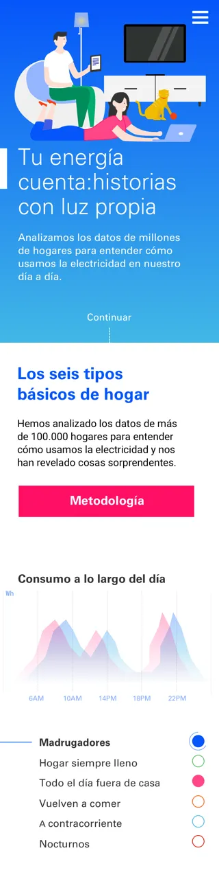
Endesa's Marketing Department request us to create a story from a dataset containing energy consumption records for over 30 million households. Translating consumed watts records into an interesting story was the real challenge.
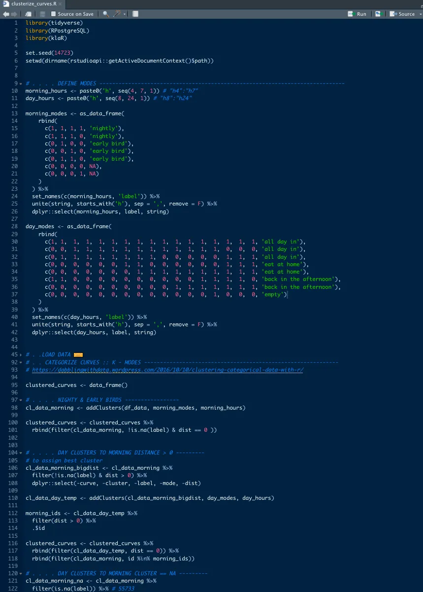
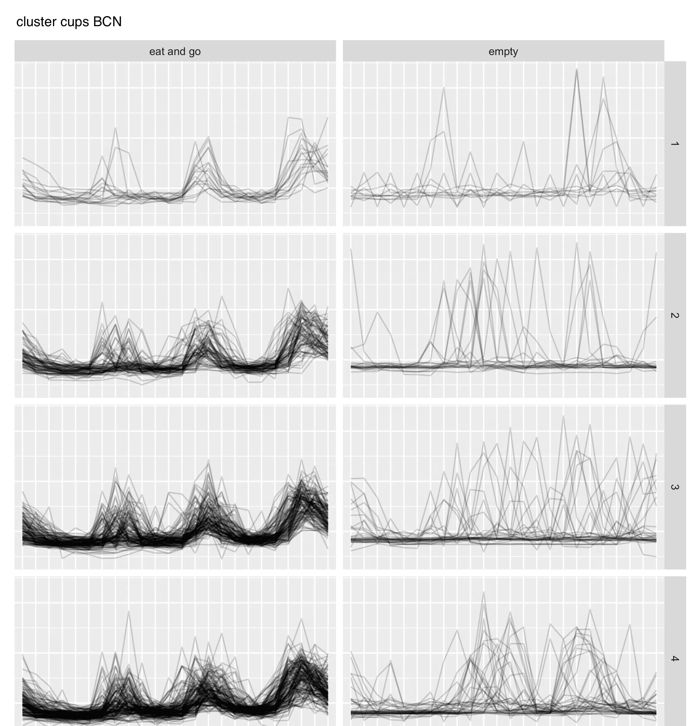
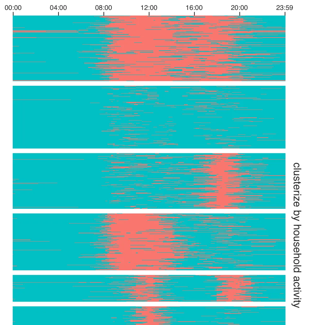
We successfully overcame it with an exhaustive data analysis process. First, we developed a methodology that allowed us to identify active and inactive homes at any given time. Then, using clustering techniques for time-series, we got groups of households that were active/inactive at similar times during the day.
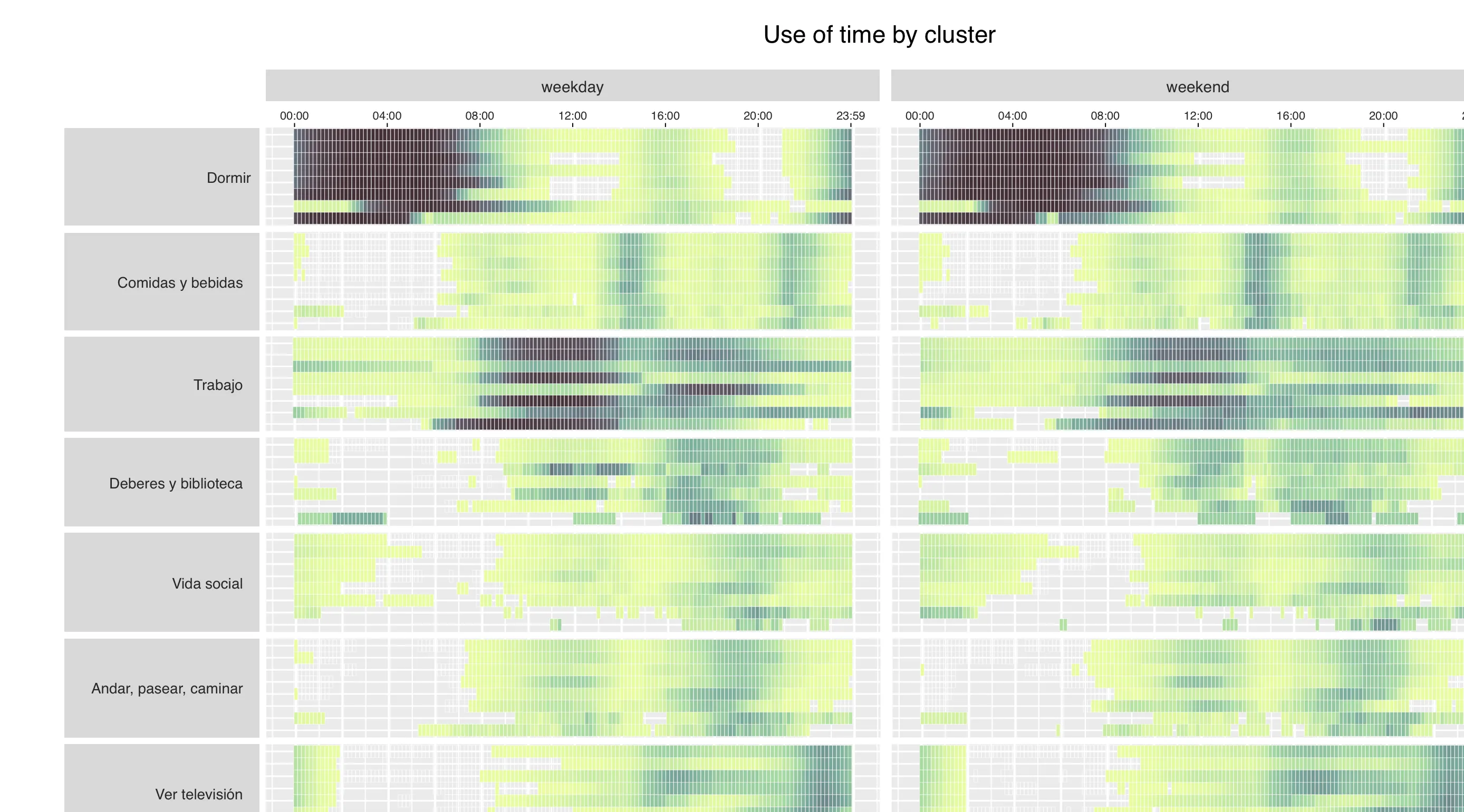
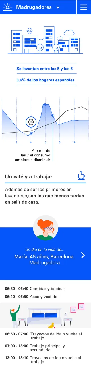
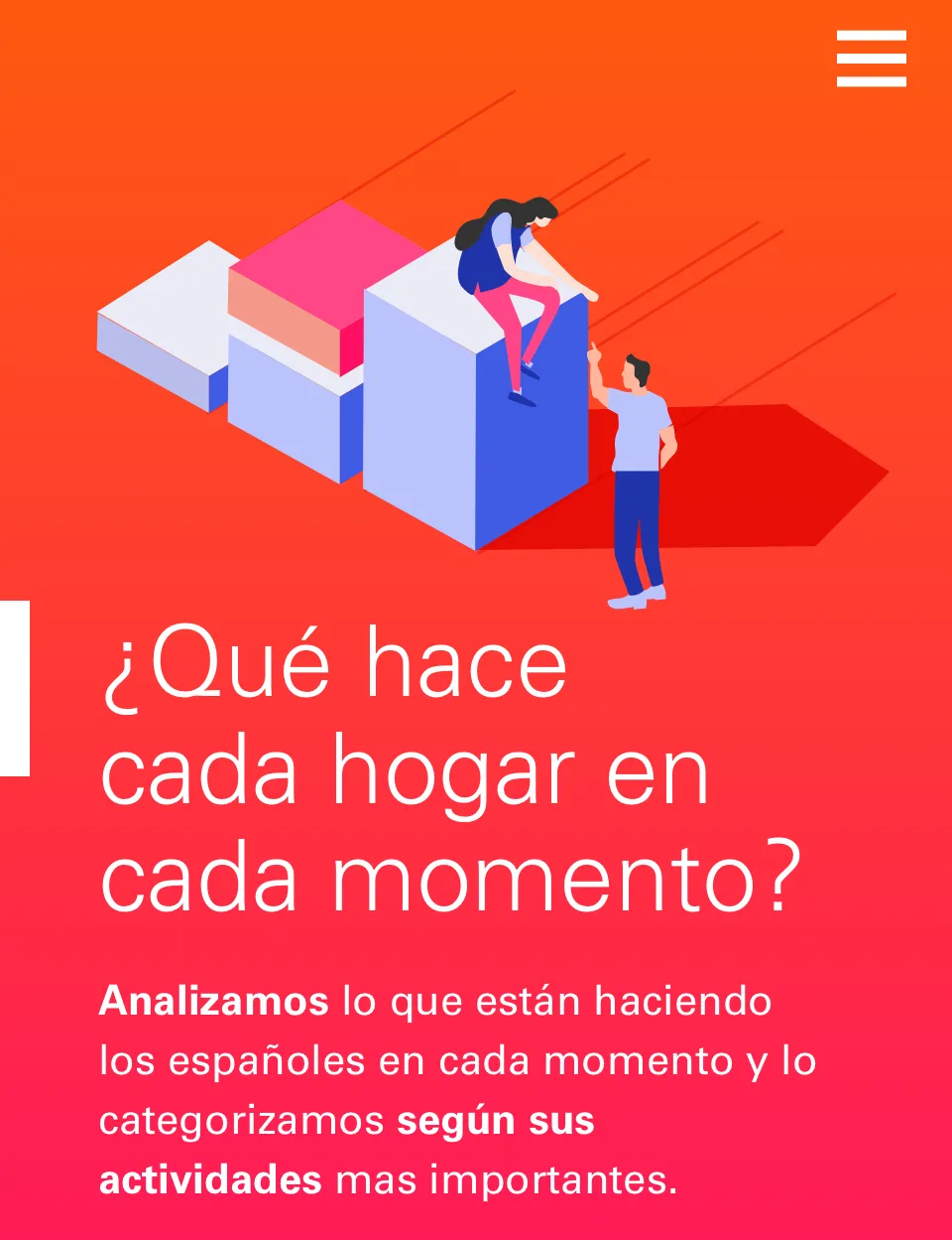
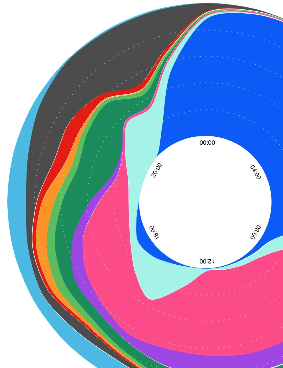
At this point we needed more to tell the story. So, to enrich the client's data, we combined it with the Spanish Time Use Survey. This survey reveals the activities performed in households throughout the day (activities such us paid work, childcare, volunteering, socializing…). By applying the same clustering criteria to the survey results, we obtained a typology of households mergeable to the previous one.
The fusion of the two data sources allowed us to understand both, the household activities when they were using energy and the activities of the people during periods of low energy consumption. This was the starting point for crafting our story.
We developed a storytelling that guides users through the story, complemented by interactive visualizations that present data in a clear and accessible manner.
The final result was a mobile-first site, where millions of records of watts consumed and thousands of activities performed had been transformed into something easy to explore and understand.
Scroll down to see the pics of some of the work underneath